“Design is not just what it looks like and feels like. Design is how it works.” –Steve Jobs
„What do you actually do? You make presentations beautiful? So artistic work…“
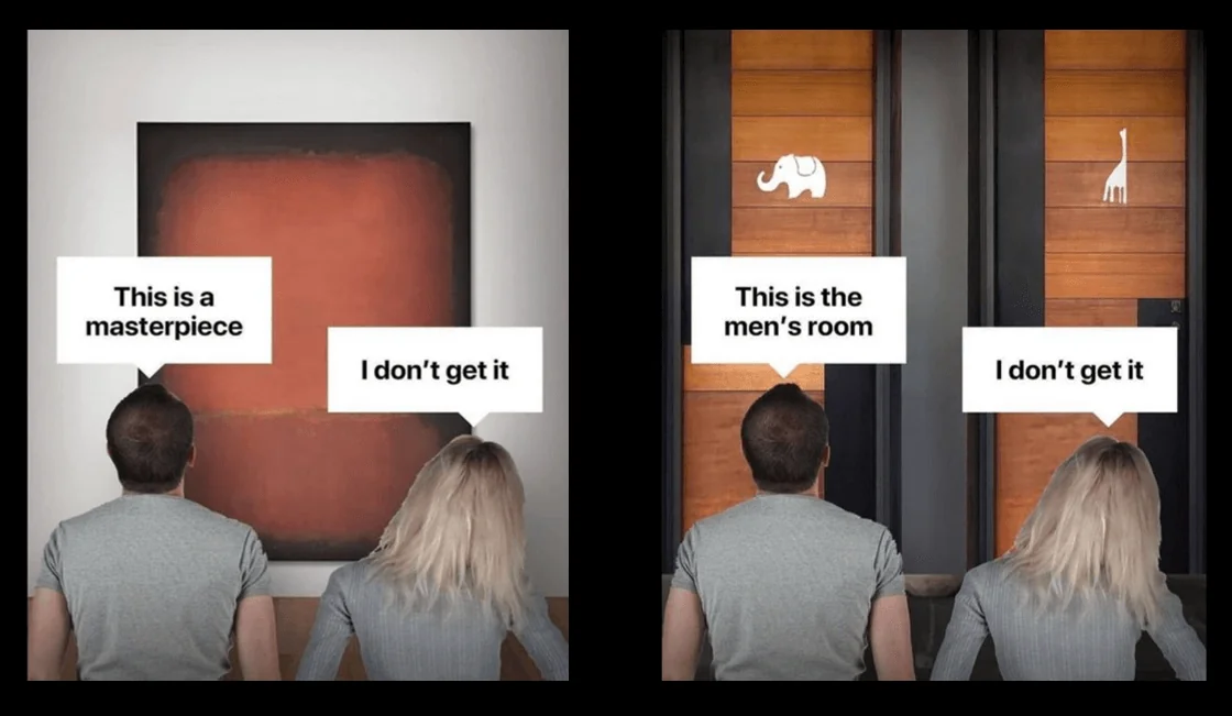
OH.. No, we make presentations functional. That’s not art!
Definition of art: creative design from a variety of materials or using the means of language and sounds in dealing with nature and the world
Art is open to interpretation, and our job is to avoid exactly that!
I don’t even know where to start. Even though this topic is so important to us. Because so often we almost have to defend our actual job and our actual value in front of people/clients/customers.
„I don’t need presentation design because I focus on my content and not on how pretty it looks“ – This is just one example of the misunderstanding of communication design.
The dictionary defines the word design as the formal and functional design and the resulting form of a utility object. / Object of practical use
A presentation IS an object of practical use. It is intended to communicate. Shouldn’t this be done in the most advantageous way?
Designing presentations is a craft and good and memorable presentations, regardless of the context in which they take place, are the result of specific communication skills.
Every presentation has a unique purpose. Evil tongues claim:
… that companies today spend more on the appearance of their presentations than on the content.
…that most presentations are boring and unnecessary.
…that people embellish their presentations so that no one can see that the content is nonsense.
I say: Please stop!
I mean, I really love bashing and making fun of presentations myself… which is a shameful character flaw, but I also laugh at my own crap. So, I guess we’re all cool with that, right? :D
Manchmal hat man nicht die Zeit, eine Präsentation so gründlich vorzubereiten, wie man es vielleicht gerne würde. Es ist nicht Deine Kernaufgabe, Präsentationen zu erstellen. ABER ES IST UNSERE!
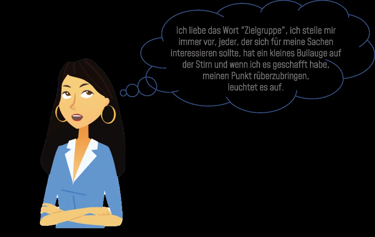
Präsentationsexperten überprüfen Präsentationsinhalte aus der Perspektive der Zielgruppe heraus.
Presenting to peers is a very different game than presenting to a wider audience where you want to raise awareness of an issue.
We ask a lot of stupid questions about your presentation, but why do we do that? > So that no one asks stupid questions AFTER your presentation.
Our goal is to communicate clearly, cover all aspects and ensure that the intended communication goal has been achieved.
Starting with the structure and sequence of the presentation, we create a story line.
„But I’m just presenting facts and figures“ – who says it has to be just a boring list of information? Make the numbers sexy; it’s possible.
https://www.amazon.de/DataStory-Explain-Inspire-Action-Through/dp/1940858984 Book recommendation data story
Hi&Lo Agency
The appropriate style, selected visual support, level-specific formulations and the unique style (The noun style describes a person’s characteristic way of expressing themselves. Also a person’s own style when speaking and writing, …) are just as important as the overall structure of the slides.
Some argue that the speaker is the center of the presentation…
This is ONLY true for speaking presentations or presentations to your team or when you want to achieve a specific result for yourself.
In large companies, information presentations/team calls, reviews, etc. are important for management to manage the company and get an overview of the departments and their KPIs. Why do I think that the presenter is not the focus of these types of presentations? Because their core purpose here is to provide information in a clear manner. I even think that it is inappropriate to give these presentations a personal touch.
But the same person could also be a team leader who presents to his team why a team building event is useful, or he informs his team about adjustments or even major changes, in which case: YES. The presenter is the center of the presentation because his presentation has multiple purposes
-
- To inform about something
- To motivate your team to work towards a specific result
- To create confidence in his leadership qualities
So yes… before you ask: PRESENTATION SKILLS ARE RELEVANT TO LEADERSHIP SKILLS
If we look at Elon Musk’s presentation skills… he’s not the strongest speaker, but he’s charming, he’s motivating, he’s personable and even though he’s telling us these futuristic ideas, he creates a level of trust that gives me such a fluffy feeling that I would volunteer to board the next falconeX to colonize Mars.
The correct use of structure and story arc gives presentations a more memorable aspect, regardless of the presentation format or the target audience.
Many people also have concerns that presentation designers don’t take into account the use of corporate design, when in reality a corporate frame is a great guideline to work with. Predetermined colors, fonts, style elements and measurements along the line actually support a designer’s work to create functional slides.
Because of our cultural background, our eyes scan slides from top left to bottom right. Any complicated concept diagram or chart will not serve its purpose if people are left alone with it. If you design the slide according to the structure of your thought, it will be easier to understand and of practical use.
I hope that after all the differentiations on the internet between art and design, I was able to help a little to explain that design is the targeted purpose of communication, where the form follows the intended function and that it has nothing to do with art.
Falls Ihr Fragen, Anregungen oder ein „Kunstprojekt“ habt, was eigentlich mal eine PowerPoint Präsentation werden soll, meldet Euch. Wir stehen mit Rat und Tat zur Seite.

https://www.linkedin.com/in/daniela-lopez-acevedo-361080a1/ Daniela Lopez
Author (hover to contact)
Hi&Lo Agency