Oops, we did it again. Our favorite month „Font February“. Why do we keep making this a topic? Why are we so obsessed with fonts? Because it’s SO important ! It is important how you read a word or text and what you associate when reading.
In the corporate PowerPoint world, we have a dominator, a monarch, an undefeated champion. His name is „Arial.“ A font so commonplace, so ubiquitous, that we don’t even question its origins or its „right to exist.“ It’s just there – and we have to live with it.
Arial is a font that is used by default in almost every document.
When you start to look at them consciously, you will feel the following:
-
- familiarity
- Simplicity
- symmetry
- resistance
- clarity
Aren’t all these words attributes that we all want for our lives?
Could it be that this familiarity and simplicity is the reason why we do not question this default? Why we accept Arial as a permanent partner in our lives and, more importantly, in our field of vision? We have brought you several articles about the architecture of fonts, the history of fonts, etc. But apart from an article about the faux pas of using Comic Sans, we have not expressed our feelings about the small characters and symbols that make up our literary world.
Fonts are like handwriting; they have certain characteristics and you intuitively or unconsciously associate something with them. That’s why they sometimes convey emotions. You think that’s impossible? (ok, then please take a step back and read our blog article: Comic Sans what have you done?! )
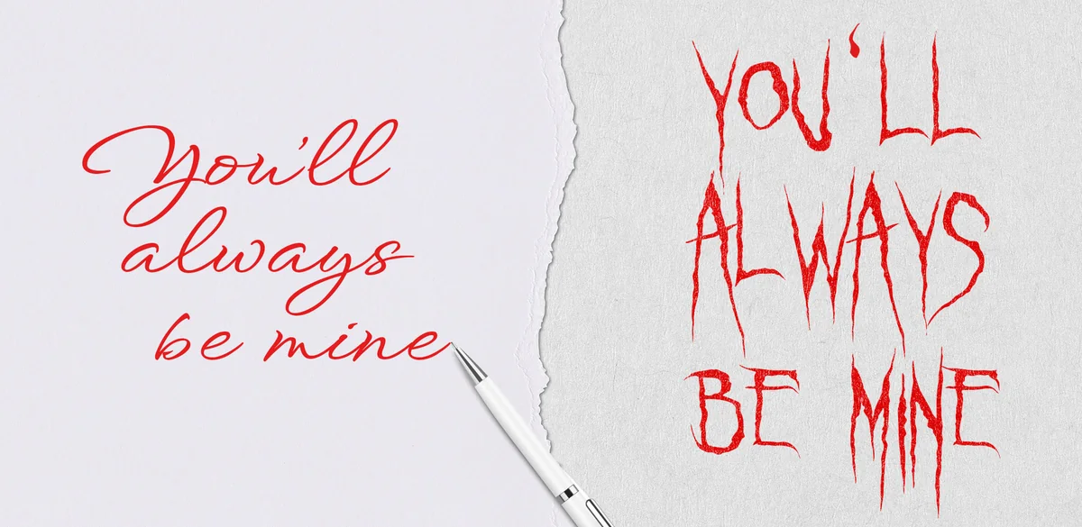
Look at these two examples of the same sentence:
I assume you’ll agree that one could be a love letter and the other a threat.
But we’re not really talking about handwriting here, even if the font you’ve chosen has become a bit like handwriting. Some people choose their font intuitively, others choose it carefully.
In PowerPoint we mostly deal with Arial. The font that is not selected and is simply supplied is the number one font in many company presentations. The company may even have a house font, but since most employees neglect the corporate design and usually don’t even bother to download the house font to their laptops, Arial remains.
We are all the happier when we receive presentations from companies with PowerPoint guides and the use of their corporate font. 😃
Choosing fonts for presentations is one of our favorite tasks. We would like to show you our 2022 highlights of presentations with selected house fonts.
We We don’t really want to show off, but we just have style 😉 .
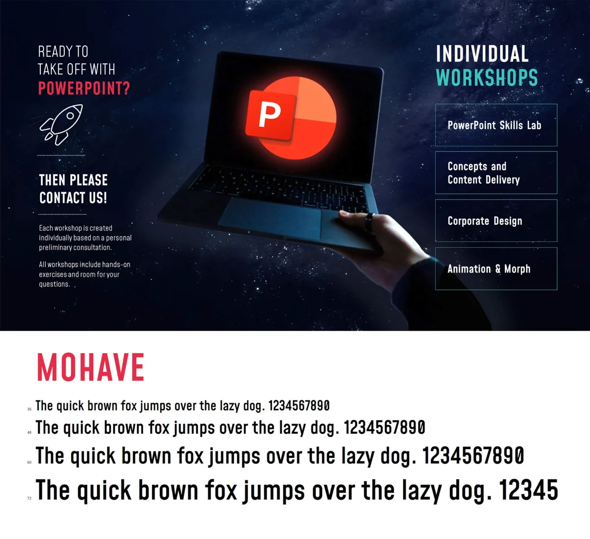
Our chosen house font is called Mohave . We love it, we chose it and there are many irrational reasons why.
Look at this font:
The overall image has a graceful, almost Gothic flair due to its verticality. Similar to the construction of a church window. The font also has something soft about it, as can be seen in all the letters that have curves. Pay particular attention to the capital S, the capital R, the lowercase f and the lowercase g. Isn’t the architecture of this font really unique? It has a perfect ascender to descender ratio. Look at the lowercase y. This is a playful plus point in the font, as this is the only letter where the descender has been shortened and is disproportionate to the descenders of the other letters. The lowercase letters themselves are clean and (sorry) simply delightful. The font is clear and easy to read, yet so elegant.
This is a font that can easily be used for themes with a feminine yet serious, creative yet informative, fashionable yet timeless content. (You understand now why we considered it suitable for us, right?)
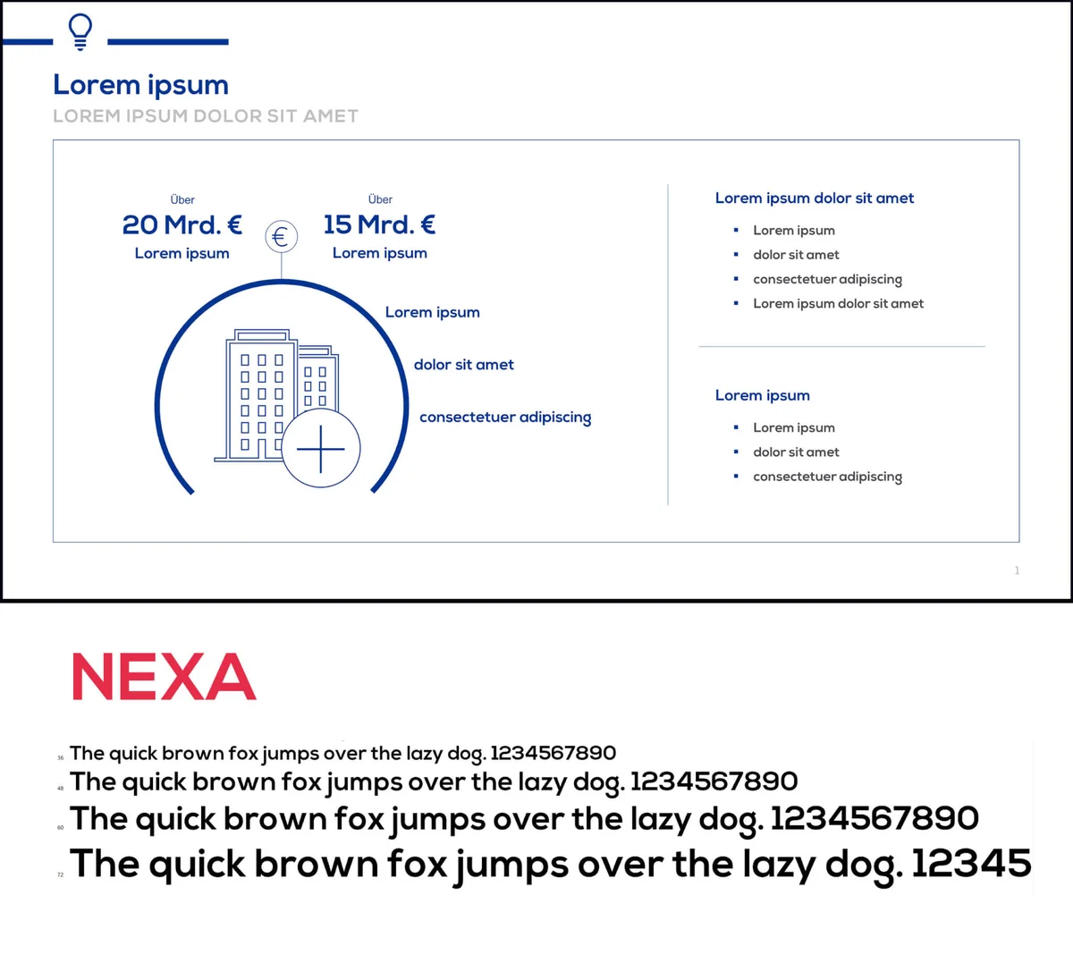
We found this font in the presentation of a client from the financial sector. The font is called Nexa .
This font stole our hearts because it has several small features. Look at the capital M. Notice how the diagonal doesn’t extend that far into the letter? That’s a very unique but elegant proportion compared to the width of the individual letter. The font is a linear sans serif with a reasonable symmetry but with a whimsical touch in the height of the descenders (the part that extends below the baseline of the font). Look at the lowercase g. Isn’t it a nice addition to the otherwise clean and strict letter construction?
This font is great for trustworthy, reassuring and contemporary themes, such as financial products, medical information or real estate material.
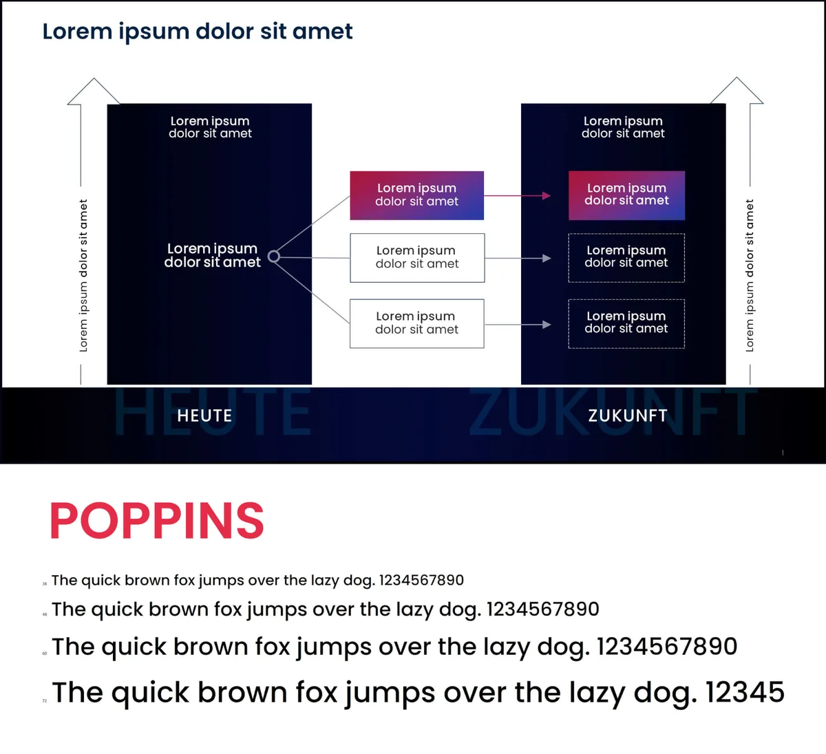
Our favorite font of 2022 is Poppins . We chose it for a corporate design rebranding, and there are many reasons for this decision. It’s one of the best fonts out there, and not just from a practical point of view. It is very legible, which is VERY important in most cases, but it also makes our eyes shine because it has extremely symmetrical interior surfaces and perfect shadow axes – and that is what makes it special. Because what we see when we look at Poppins is nothing less than the definition of futurism. With its clean lines and perfect geometry, it is predestined for any modern professional context. That is why we have selected it with great care for Europe’s leading Future Consultants.
Das waren unsere Top 3-Schriften des Jahres 2022. Ja, wir wissen, dass viele Leute denken, sie hätten kein Interesse an Schriftarten. „Benutzt einfach irgendeine“. Das sehen wir in Präsentationen tagtäglich. Das ist nicht nur eine verpasste Chance, (subtile oder sehr direkte) Emotionen in den Text zu bringen, sondern es ist auch gefährlich. Schriftarten haben einen nachteiligen Einfluss auf die Art und Weise, wie wir eine Botschaft wahrnehmen. Denken Sie nur an unser Beispiel mit dem Liebesbrief. Deshalb sind wir hier, um ein Plädoyer für Schriftarten zu halten. Schiebe es nicht beiseite. Lerne, sie zu benutzen, sie werden wirklich treue Freunde sein!
Dir ist noch nicht ganz klar, für welche Schriftart du dich entscheiden sollst? Oder vielleicht bist du auch nicht sicher, ob deine gewählte Schriftart die richtigen Vibes aussendet? Wir prüfen das gerne für dich. Schreib oder ruf uns an – wir freuen uns, die passenden Schriften für dich zu finden.

https://www.linkedin.com/in/daniela-lopez-acevedo-361080a1/ Daniela Lopez
Author (hover to contact)
Hi&Lo Agency
[ /av_one_fifth]