“Font Choice? Well that is definitely a matter of taste”
Design is our livelihood and we often ask ourselves how many of our projects are based on the science of design and how much of our output is simply just a matter of taste. Especially when it comes to topic of font and font design, some would say it’s all about our preferences.
To clarify this question, we need to digress a bit, to be precise to the place where we first need to define these terms:
Taste
Taste is an individual’s personal, cultural and aesthetic patterns of choice and preference or judgment to which everyone has an opinion.
Design
A design is a plan or specification for the construction of an object or system or for the implementation of an activity or process, or the result of that plan or specification in the form of a prototype, product or process. The verb to design expresses the process of developing a design.
Source: https://en.wikipedia.org/wiki/Design
Ideation
Ideation is the creative process of generating, developing, and communicating new ideas, where an idea is understood as a basic element of thought that can be either visual, concrete, or abstract.
Source: https://en.wikipedia.org/wiki/Creativity
+++and since we’re not in college anymore, Wikipedia is a legitimate source for us 😉+++
So Design is Subject to certain Rules
The division of a visual construct intuitively already provides information about whether the number one design rule has been considered, the golden ratio, a really, really old geometrically proven uniformity. The human brain loves consistency, uniformity, and symmetry.
The golden ratio means nothing else than that humans are so arrogant that we also equate the optical perfection of OUR likeness.
Symmetrical from left to right, in the vertical we have a slight tendency to shift the center upwards. By the way, the creative optical middle is 10% above the real middle… why do you think that is?
We find everything good that corresponds to us. Our brain confirms a familiarity and thus we feel able to judge “beauty”. For example, why is Jessica Alba’s face the most famous when it comes to perfection? She has computer-measured the most symmetrical, proportionally best face of all celebrities.
Beauty lies in the Eye of the Beholder?
Yes and No. Beauty lies in the geometric construction of our brain, which evaluates an object, a visualization, according to self-reference.
What does all this have to do with fonts? Let me get to that.
In design, even in font design, there is one rule:
Form follows function: a design must be purposeful and functional. A typeface should be even more!
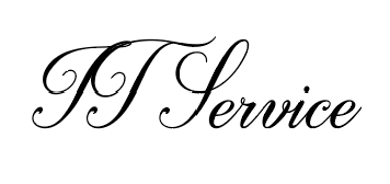
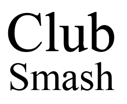
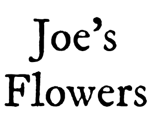
Do you have the impression these businesses are fully competent in their field?
How do you perceive these messages?
Not only are each of these statements really bad. The font implied that it could be a statement of a specific company who use these fonts in their corporate design… so again for the record, fonts are not a matter of taste at this point, but a matter of association!
And further on the topic of taste theory
When customers talk about good design or about taste, they often say “can we make this a little Apple-y?” and they mean the plain, “functional” Apple design.
Apple has always cut everything that was unnecessary and did not contribute to a direct user experience. Hardly anyone says that a MacBook or an iPhone is ugly and why not? Because it is (again) purposeful and functional.
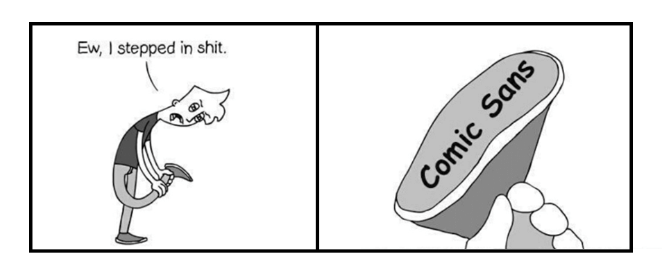
Considering the examples, I’ve already provided above, you should realize that fonts can trigger certain reactions or implications. They can override a competency or inspire confidence. They can immediately assign or connect and assure quick comprehension. Which means used correctly, they can convey a desired impression.
With the proliferation of digital fonts and the endless possibilities they have created, design teams often have the agony of choice.
Let’s take a look at a few fonts that are popularly used by various industries:
Yes, as I said: The agony of choice.


 HiLo_agency