Animationsphobie (Nomen) – die irrationale Angst, dass Ihre PowerPoint lächerlich aussehen könnte
„Aber bitte nicht so viel animieren, nicht dass da alles einfliegt und alles sich die Inhalte irgendwie bewegen“
So oft hören wir diesen Satz von Kunden, aber wo kommt diese Abneigung denn eigentlich her?
Animationen in PowerPoint sind eine kleine Kunst für sich. Falsch angewendet und die gesamte Präsentation wirkt nervös und dilettantisch. Dabei sind Animationen in Präsentationen soooooo wertvoll.☝️
Dass Videos und Bewegtbild zum aussagekräftigsten Medium gehören, beweisen solche Portale wie YouTube, Vines oder Tiktok. Das menschliche Gehirn reagiert wesentlich besser und schneller auf einen Bewegungsablauf als auf statische Bilder oder das geschriebene Wort. Es ist leichter zu verstehen, schneller einzuordnen und ruft unterbewusst Emotionen hervor. Durch diese Emotionen sind wir aufnahmefähiger und es tut sich mehr in unserem Gehirn und dadurch mit unserem gesamten Nervensystem.
Wenn sich eine PowerPoint smooth bewegt, behaupten die Leute, das wäre Prezi. Prezi, liebe Freunde der guten Präsentation, hat nur (ACHTUNG) folgende Animationsmöglichkeiten:
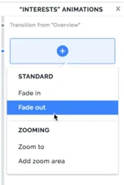
PowerPoint has over 40 that can be combined with 7 different paths. This brings us to (Shit.. 40 times the combination with your own animations and 7 possibilities of the paths. 40 times 40 times 7 over 40 so 40 faculty… right?
….whatever. There is a lot anyway.
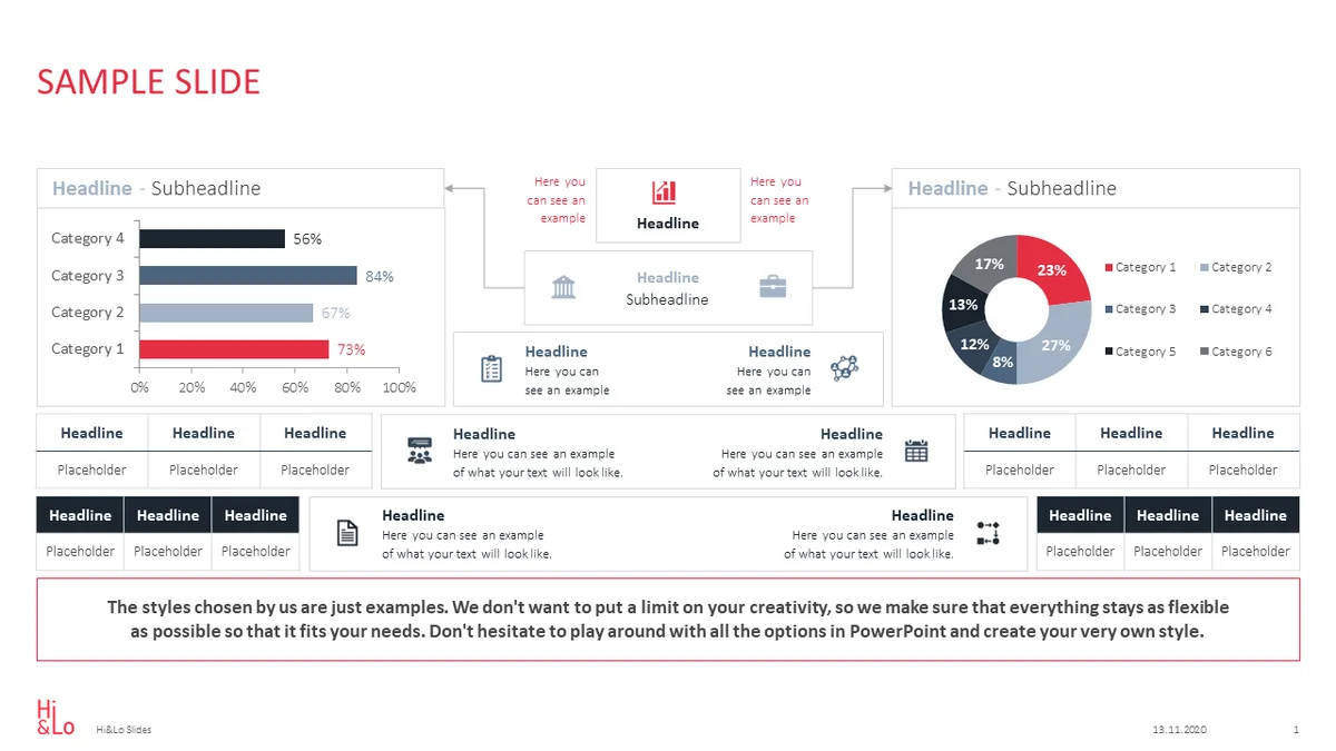
When presenting information in a company, customers prefer to show the content statically because they are afraid that the slide might look ridiculous to colleagues and superiors. It is helpful if the content can be structured chronologically .
For cultural reasons, our eyes scan a presentation slide from the top left to the bottom right. In many cases, however, the beginning of this slide is in the middle, for example, at the bottom, and this creates a dissonance for the viewer with a static slide. This dissonance causes a delay in understanding in the brain. It is therefore simply a waste of time.
Especially when the slide is a diagram , it makes sense to direct the audience’s attention to what the speaker is trying to point out. Of course, you can do all of this with a wobbly laser pointer, but let’s be honest… it’s more ridiculous to give your presentation with a cat toy than to animate the slide in a meaningful way.
✅ Without prejudice, it is safe to say that animations help rather than hinder.
Let’s take another example:
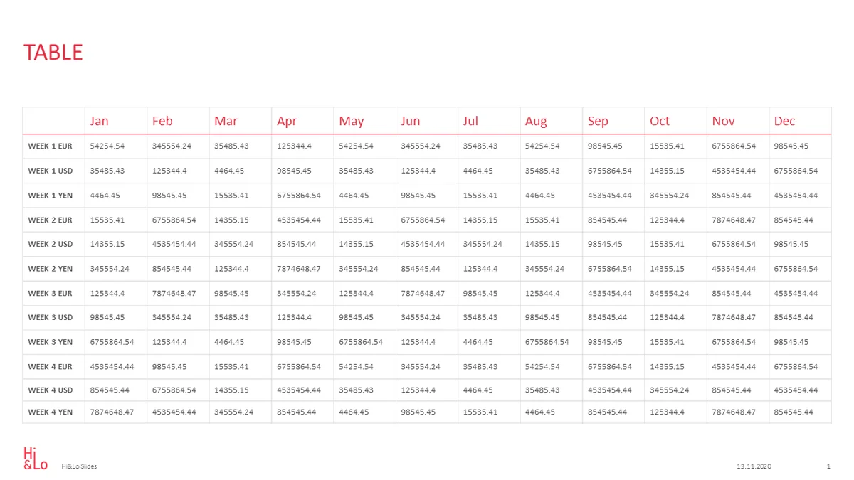
A packed table with important figures from the last financial year
Even if every presentation expert is screaming and every designer thinks that it looks like crap, it is unavoidable that a simple table is needed in one presentation or another.
* Please note that these are information presentations that are still used in everyday work and are not Speaker presentations that are spoken from a stage .
Back to our table. It is much easier to follow the numbers if you look at the columns individually. You don’t have to look at every single cell, but at least you can highlight column by column or row by row, depending on how the structure is intended, and this way the listeners can follow better and their eyes don’t wander pointlessly over the slide while you are presenting.
“Yeeeeeeah, BUT we have to send our presentations internally, then animations don’t make sense”
Of course it’s important that the whole thing is explained first. Then it’s easier to guide the eyes that then look at the charts that have been sent out. Then they’ll already be much more informed and will have your train of thought much more clearly in front of them.
Subtle and targeted animation is by no means cheesy, it is another building block of good communication.
If you have any questions about animations and information presentations, please feel free to contact us . We look forward to hearing from you.

https://www.linkedin.com/in/daniela-lopez-acevedo-361080a1/mailto: lopez@hilo-agency.de Daniela Lopez
Author (hover to contact)
Hi&Lo Agency
 HiLo_Agency
/hilo-assets/wp/2021/04/HiLo_Agency_Pyramids_Thumb.webp
711
1052
Haefele
/hilo-assets/wp/2019/08/Hi_Lo_01-final-80-80-final-1.webp
Haefele2021-04-01 20:39:212021-05-18 17:17:05Pyramiden oder nicht Pyramiden…
HiLo_Agency
/hilo-assets/wp/2021/04/HiLo_Agency_Pyramids_Thumb.webp
711
1052
Haefele
/hilo-assets/wp/2019/08/Hi_Lo_01-final-80-80-final-1.webp
Haefele2021-04-01 20:39:212021-05-18 17:17:05Pyramiden oder nicht Pyramiden… /hilo-assets/wp/2021/03/HiLo_Agency_Blog_this-could-have-been-an-e-Mail_Thumb-1.webp
705
1076
Haefele
/hilo-assets/wp/2019/08/Hi_Lo_01-final-80-80-final-1.webp
Haefele2021-03-11 18:59:382021-07-09 12:34:26INFORMATIONSPRÄSENTATIONEN- This could have been an E-Mail?
/hilo-assets/wp/2021/03/HiLo_Agency_Blog_this-could-have-been-an-e-Mail_Thumb-1.webp
705
1076
Haefele
/hilo-assets/wp/2019/08/Hi_Lo_01-final-80-80-final-1.webp
Haefele2021-03-11 18:59:382021-07-09 12:34:26INFORMATIONSPRÄSENTATIONEN- This could have been an E-Mail? HiLo_Agency
/hilo-assets/wp/2021/02/Geschmackssache-Typeface_2.webp
709
1064
Haefele
/hilo-assets/wp/2019/08/Hi_Lo_01-final-80-80-final-1.webp
Haefele2021-02-03 18:46:342024-11-24 15:23:25Schriftgestaltung – Geschmack oder Wissenschaft?
HiLo_Agency
/hilo-assets/wp/2021/02/Geschmackssache-Typeface_2.webp
709
1064
Haefele
/hilo-assets/wp/2019/08/Hi_Lo_01-final-80-80-final-1.webp
Haefele2021-02-03 18:46:342024-11-24 15:23:25Schriftgestaltung – Geschmack oder Wissenschaft?