Comic Sans what have you done?
FONT SELECTION. Some neglect it, some embrace it. But it takes a special font to cause such a commotion like the 1994 Microsoft established font “Comic Sans”. Ever since then it was less comical and surely not sane how this font has raised emotions.
Connare the designer who created this font affectionately referred to Comic Sans as “the Justin Bieber of fonts,” probably talking about how it ends up in places it shouldn’t be in. (Quelle:https://bookriot.com/why-does-everyone-hate-comic-sans/) So, we love to hate it… Here are some reasons why:
1. Comic Sans has a non-geometric appearance
The human eye strives for symmetry. Every beauty ideal is measured by it. You can say whatever you want but as cute it might be for a Pre-school (who’s inhabitants also can’t write yet) as disturbing will it be in a professional context.
2. Comic Sans has poor kerning
„Kerning“ describes the spacing of the letters. Visually some letters need to be closer together than others to find a balance. This is one of the factors why everything in Comic sans looks like its scrambled together and gives it this infantile touch.
3. Comic Sans had only one specific purpose
It was originally designed for Rover the dog. Vincent Connare, the poor guy who created this booboo could simply not stand the thought of a dog talking in Times New Roman.
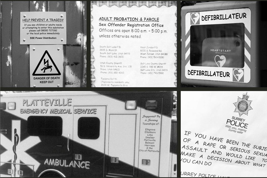
But the MOST Important reason: It makes important Messages look ridiculous:
We found these examples on the Website https://www.comicsanscriminal.com/
Please let us know all your feelings about Comic Sans, we have plenty of memes to respond to you💗


 HiLo_Agency