“Design is not just what it looks like and feels like. Design is how it works.” –Steve Jobs
“What is it you do? You make presentations pretty?? So this is artistic work….”
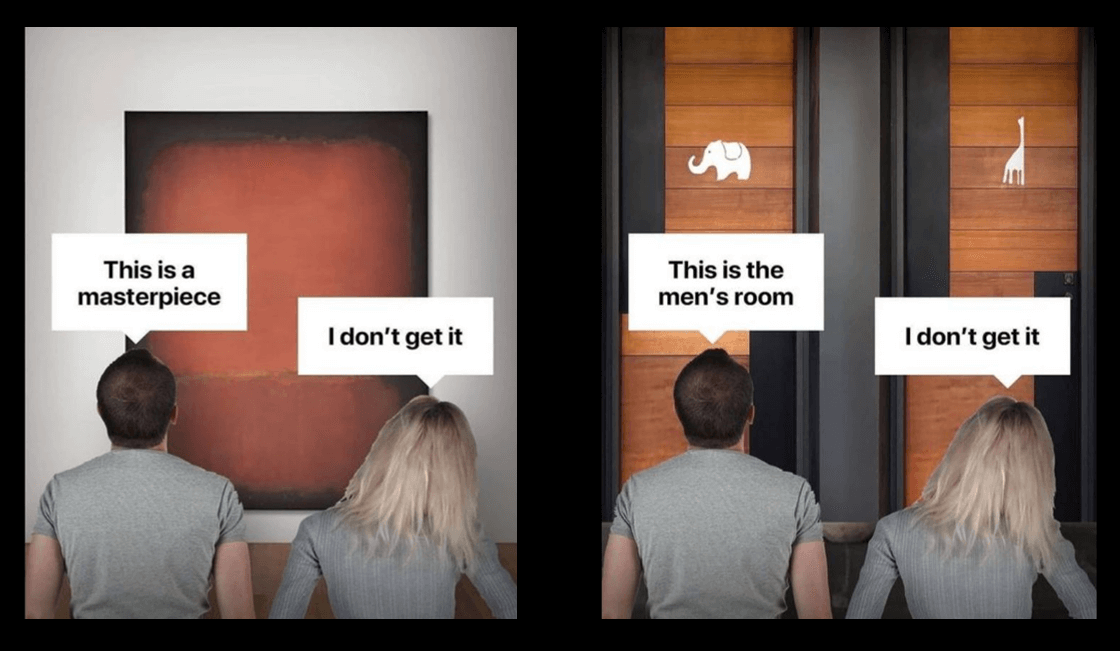
OH.. No, we make presentations functional. This is not Art!
Definition of Art: creative design from a wide variety of materials or with the means of language, sounds in confrontation with nature and the world.
Art is up for interpretation, and it is our job to prevent that!
I don’t know where to begin. Even though this topic is so important to us. Because so many times are we defending our actual profession and our actual value to people/ clients/ customers.
“I don’t need a Presentation Design because I focus on my content and not how pretty it looks”- This is just an example of the misunderstanding of communication design.
The dictionary defines the word design as the functional creation of form and the resulting shape of an object of practical use.
A Presentation IS an object of practical use. You want to communicate with it. Shouldn’t this happen in the most beneficial way?
Designing presentations is a trade and good and memorable presentations no matter the framework are the result of a specific communication expertise.
Every presentation has a unique purpose. Malicious assertions are:
… that companies spend nowadays more on the looks of their presentations than the content.
…that most presentations would be boring and obsolete.
…that people fluff their presentations, so no one sees that the content is bullshit.
I say: please stop it.
I mean I really love to bash and make fun of presentations… which is a shameful character flaw but I am also laughing at my own crap. So, I think we can be cool. :D
Sometimes you don’t have the time to prepare a presentation as thorough as you might want to. It is not your core job to make presentations. BUT IT IS OURS!
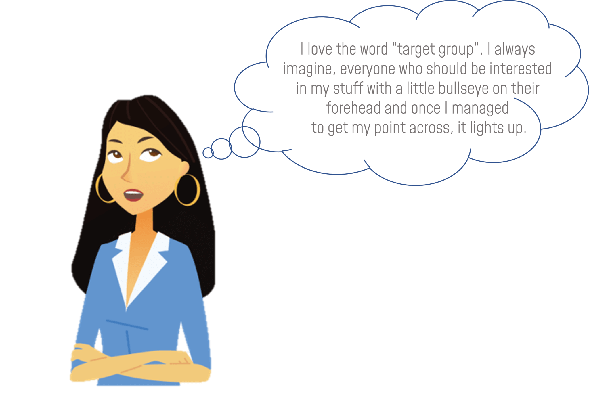
Presentation experts review your presentation content out of the position of the target group.
If you are presenting to your peers, it is a different game than if you are presenting to a broad audience where you want to increase awareness for your topic.
We ask a lot of stupid questions about your presentation but why are we doing this? > So no one will ask stupid questions AFTER your presentation.
Our goal is it to communicate clearly, cover all aspects and make sure the intended communication goal was met.
Starting with the structure and order of the presentation we arrange your Story-line.
“But I only present facts and numbers” – well who says that this just needs to be a boring listing of the information? Make your numbers sexy, it is possible.

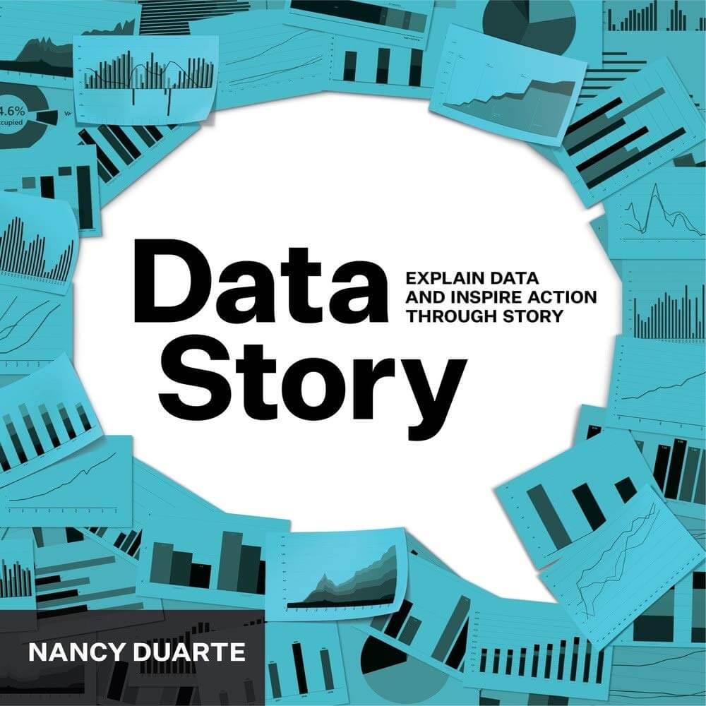
Book Recommendation: Data-Story
Hi&Lo AgencyThe corresponding stylistics, selected visual support, level-specific wording and to the unique ductus (The noun ductus describes the characteristic way of a person to express himself. That is, a person’s own style of speaking and writing, etc) are equally as important as the entire construction of slides.
Some argue that the presenter is in the center of the presentation…
This is ONLY correct in speaker presentations or presentations to your team or if you want to create a certain outcome for yourself.
In large corporations, the information-presentations/ team call, reviews etc. are important for the management to steer the company and gain an overview of the departments and their KPIs. Why do I think the presenter is not the focus of these kinds of presentations? Because they have no other message but to inform vividly. I even think to create this presentation with a personal note is uncalled for.
However, the same person could be a team leader present to his team, why a teambuilding event would be beneficial, or he informs his team abut adjustment or even bigger changes, in this case: YES. The presenter is the center of the presentation, because his presentation has multiple purposes
-
- To inform about something
- To motivate his team to work on a certain outcome
- To create trust in his leadership skills
So yes… before you ask: PRESETNATION SKILLS ARE RELEVANT IN LEADERSHIP SKILLS
Even if we look at the presentation skills of Elon Musk… he is not the strongest speaker, but he is charming, he motivates, he is sympathetic and even though he tells you these futuristic ideas he creates a level of trust that makes me feel so fluffy, I would freely board the next falconeX to occupy mars.
The correct usage of structure and story arc (arc of tension) provides presentations with a more memorable aspect, no matter which form of presentation we are talking about and what the target audience.
Many people think that presentation designers are not considering the usage of the corporate design when in reality a corporate frame is a great guideline to work with. Pre-determined colors, fonts, style elements and measurements along the line actually support the work of a designer to create functional slides.
Due to our cultural background, our eyes scan slides from the top left to the bottom right. Any complicated concept chart or diagram is not fulfilling its function if you just leave people alone with it. Ones you create the slide according to the construction of your thought, it will be easier to comprehend and of practical USE.
I hope this helped to establish that design is the targeted purpose of communication where the form follows the intended function and has nothing to do with art.
If you have questions, suggestions or an “art project”, which should actually be a PowerPoint presentation, please contact us. We would love to support you.


 HiLo_Agency
 HiLo_Agency