Almost All Fonts Matter
oops, we did it again. Our favorite month “Font February”. Why are we constantly making this a topic? Why are we so obsessed with fonts? Because it really is THAT important. It is important how you read a word or a text and what you associate while reading.
In the corporate PowerPoint World, we have a dominator, a monarch, an undefeated champion. His name is “Arial”. A font that’s so common, so omni present that we don’t even question its heritage or its “raison d’être”. Its just here- deal with it.
Arial is a font that almost every document has by default.
If you start to consciously look at it, you will feel the following:
-
- Familiarity
- Simplicity
- Symmetry
- Stability
- Clarity
Aren’t all these words attribute we all desire in our lives?
Could it be that this familiarity and simplicity is the reason why we don’t question this default setting? Why we accept Arial as a steady partner in our lives and especially in our sight? We have given you several articles about architecture of fonts, history of fonts, etc. But except for an alert article about the faux pas of the usage of Comic sans, we haven’t expressed our feelings towards the little signs and symbols that form our literary world.
Fonts are like handwritings; they have specific characteristics and you intuitively or subconsciously associate something with them. Therefore they partially transmit emotions. You think that’s Impossible? (ok, then please go back and read our Blog article: Comic Sans what have you done?!)
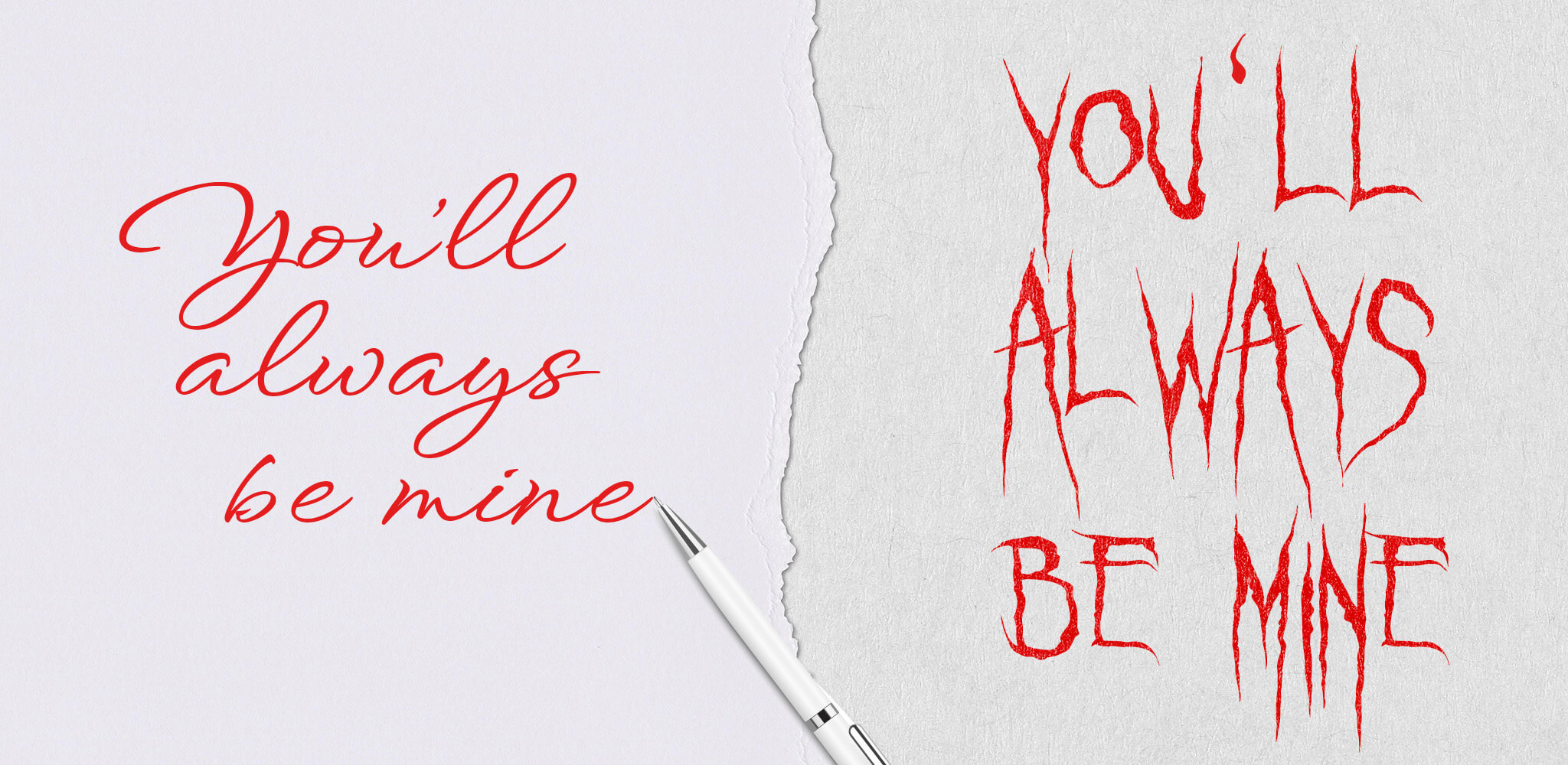
Look at these two examples of the same sentence:
I guess you agree with me that one could be a love letter and one could be a threat.
But we are not really talking about handwriting, even though which font you select has already become somewhat of a handwriting. Some chose their font intuitively; some select it with great consideration.
In PowerPoint we mostly deal with Arial. The unchosen, just conveniently provided font is in so many company presentations the number one font. The corporation might even have a house font BUT as most employees neglect the corporate design, they don’t even bother to consider downloading the corporate font on their laptops. So Arial it is.
The happier it makes us, if we are receiving presentations of companies with PowerPoint Guides and the usage of their house font. 😃
Selecting fonts for presentations is one of our favorite tasks to do. We want to show you our 2022 Highlights of presentations with selected house fonts and give you a little explanation.
Number 3
Let’s t toot our own horn, because we got style 😉
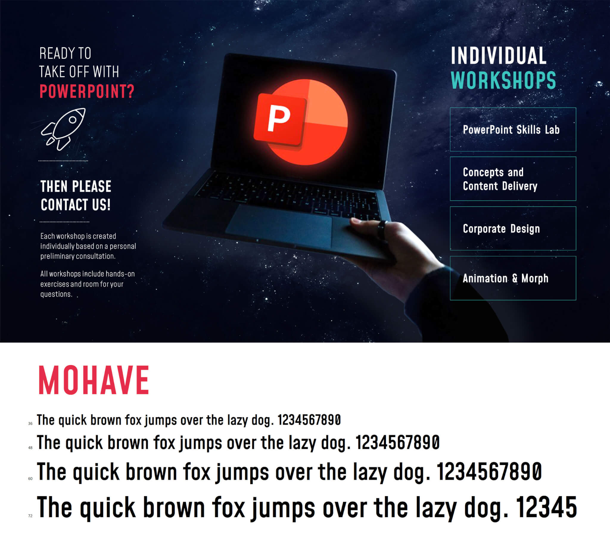
Our selected house font is called Mohave. We love it, we chose it and there are many irrational reasons for it.
Take a look at this font:
The overall look has a graceful gothic flair, because of its verticalism. Almost like the construct of a church window. The font has also a softness to it, like in all the letters that have roundings. Specifically take a look at the capital S, capital R, the minor f and the minor g. Isn’t the architecture of this font not really unique? It has a perfect upline to under line ratio. And yet, check out the minor y. This is a playful asset in the font, because this is the only letter, where the under length was shortened and is disproportional to the other underscoring letters. The lowercase letters themselves are clean and (sorry) just adorable. The Font is clear and easy to read and yet so elegant.
This is a font that can easily be used for topics with a female yet serious, creative yet informative, fashionable yet timeless topics. (You get now, why we considered it suitable for us, right?)
Number 2
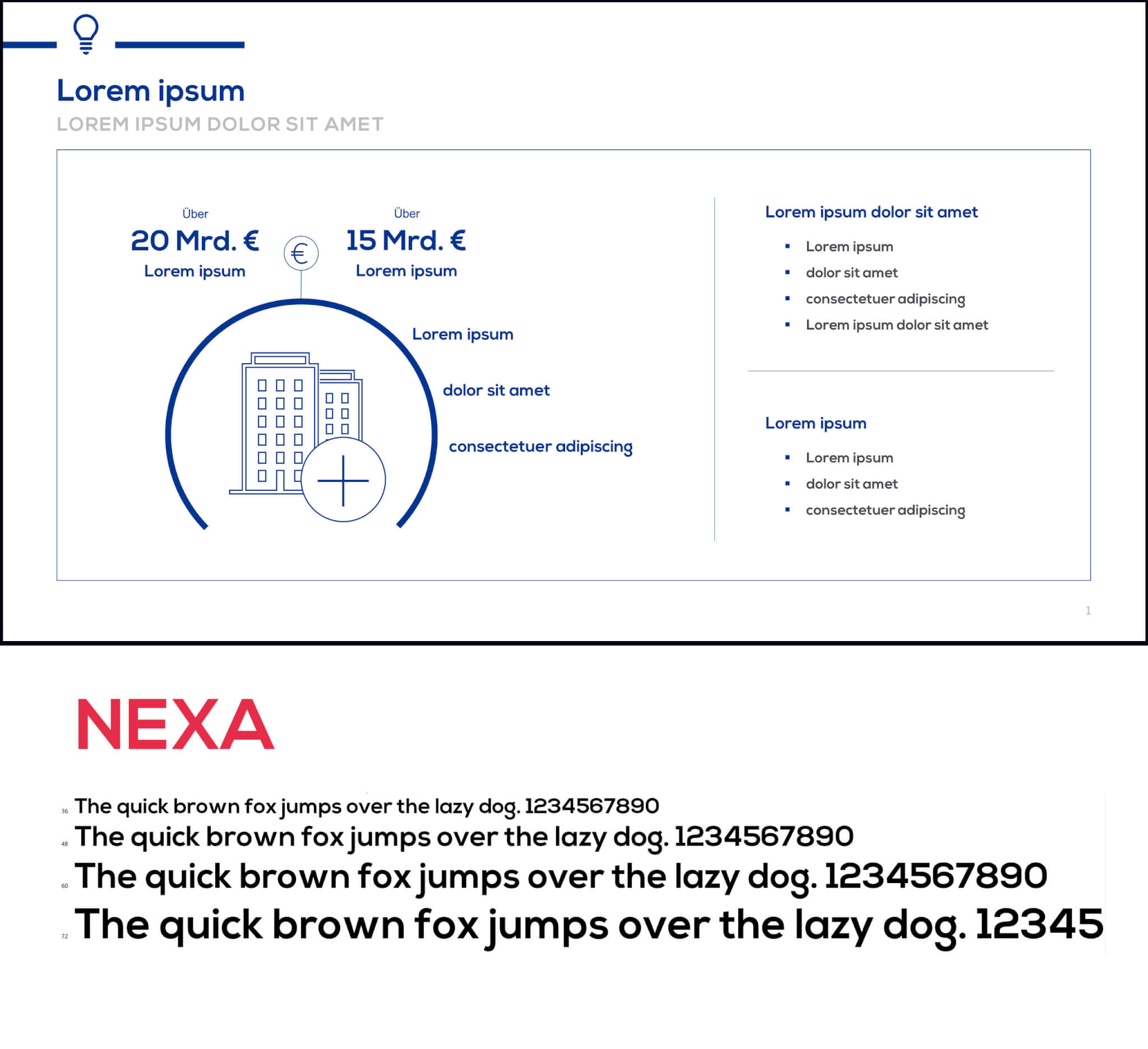
We found this font in a client’s presentation from the financial sector. The font is called Nexa.
This font stole our hearts because of several little attributes. Take a look at the capital M. Do you notice how the “Stroke” (the oblique line in the center of the letter) doesn’t reach so far into the letter itself? This is actually a very unique, yet elegant proportion in comparison to the width of the individual letter. The font is a linear sans serif with a fair symmetry but with a whimsical touch in it’s descender hight (the part that reaches below the base line of the font). Take a look at the lowercase g. Isn’t it a cute complimentary factor to the otherwise clear and strict letter construction?
This font is a great choice for confidence-inspiring, comforting and contemporary topics, suitable for topics like: financial products, medical information or real estate materials.
Number 1
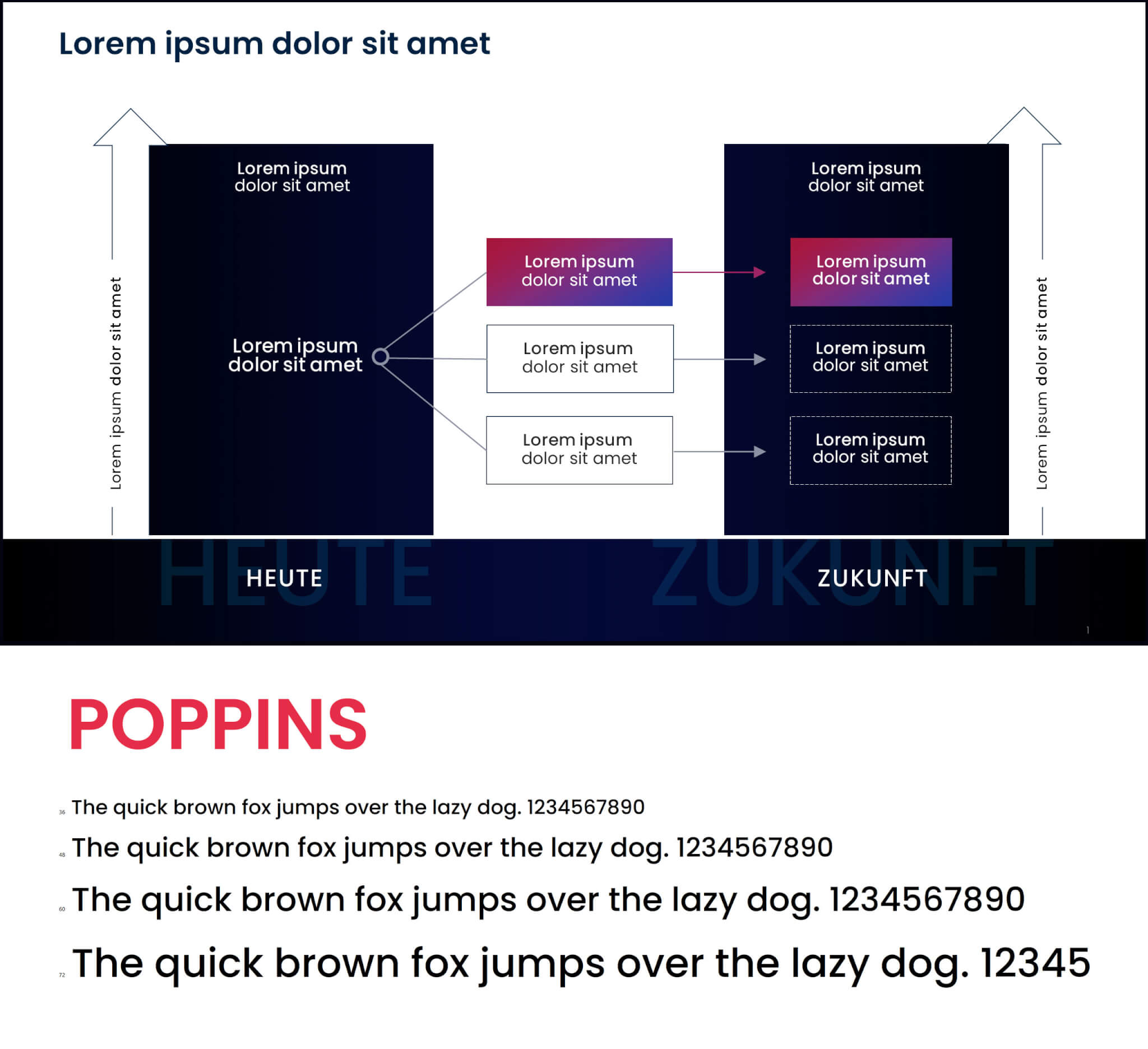
Our favorite font of 2022 is Poppins. We selected it for a rebranding of a corporate design and there are tons of reasons for that decision. Not only from a practical standpoint it’s one of the best fonts ever. It is highly readable, which is VERY important in most cases, but it also lets our eyes shine – and that makes it special. Because what we see, wenn we look at Poppins, is nothing less than the definition of futurism. With its clean lines and perfect geometry, it is predestined for any modern professional context therefore we selected it with great caution for Europe’s leading Future Consultants.
Those were our 3 top fonts of 2022. Yes, we know many people think, they have no interest in fonts. “Just use whatever”. We see that in presentations day in and day out. That’s not only a missed chance to put (subtle or very in your face) emotion into text, but it’s also dangerous. Fonts have a detrimental influence on the way, we perceive a message. Just think of our love letter example. That’s why we’re here striking a blow for fonts. Don’t brush them aside. Learn to use them, they will be very faithful friends to you!
Not quite sure which font to choose? Or maybe you’re not sure if your chosen font sends out the right vibes? We’ll be happy to check it out for you. Text or call us – we’ll be glad to help you find the right fonts for you.


 HiLo_Agency
 HiLo_Agency