The Magic of Colors – between Math, Rules and Emotions
How is it that we like some colors better than others? How is it that we can even have a favorite color? Doesn’t it sometimes make you wonder why there can be distinct color classifications in the world? Who decided that red is a signal, above all, who determined that red should be the ultimate color for “STOP” or triggering disasters?
Sometimes I stumble across posts about colors in presentations and their psychological effect. What colors say about us… sounds very esoteric in places, doesn’t it?
What are colors anyway and what should we do with them in our lives? First of all, Wikipedia spits out the following clever definition:
“A color is a sensory impression mediated by the eye and brain, which is caused by light, more precisely by the perception of electromagnetic radiation of the wavelength between 380 and 780 nanometers. It is the sensory impression by which two adjacent, structureless parts of the field of vision can be distinguished in single-eyed observation with the unmoving eye alone.[1]”
Hmmm… “electromagnetic radiation of a wavelength of 380 and 780 nanometers…”. Before we plunge “sheepishly” into the myths of meanings and classifications, let’s start with logic. So, colors have a frequency. If you look at colors in color charts, they even have numbers. If you look at colors digitally, they also have numbers. But also, it would have been hard to believe that in a world where everything can be displayed as ones and zeros, colors would have been excluded from that mathematical logic.
In other words, it means that colors are an accumulation of certain brightness components, which become a definable “tone” based on the concrete composition of wavelengths. Very cool, job done. That means that in fact every color is uniquely determinable. Right? Not right!
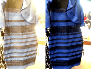
Do you remember this picture:
Honestly, I can understand that arguments have broken out here and couples have broken up. But how can you feel the same if you don’t even see the same color? But wait a minute … we are once again far from any logic. Well, it happens -()-.
But jokes aside: Colors are thus both digitally, and analogously explainable through math.
For us, who work professionally in a digital field, it is therefore very important, that we can define, store and share colors unambiguously and unmistakably. Keyword: Consistency. But as it must be, there are of course several systems:
RGB: Probably the best-known system is based on the RGB color space. This also makes sense from the physiological side of our eye, because we perceive colors through three different cone types in the eye: S cones (S = Short) are sensitive to shorter wavelengths between 400-500 nanometers, so roughly in the blue range. M cones (M = Medium) cover the medium wavelength range, i.e. between 450-630 nanometers with its absorption maximum in the green range. And finally, L cones (L = Long) allow us to perceive light in the wavelength range between 500-700 nanometers, covering the red range. We therefore see in RGB, in that the respective wavelength components are mixed additively by the brain to form the color that we ultimately “see”.
The “technical” RGB color space basically works the same way. As long as a maximum color Intensity is defined for R, G and B, almost any color can be defined through a mix of R, G and B-Values (between 0-1, 0-100% or 0-255). Just think of technical specifications for monitors, where it is a quality feature, especially in the professional field, how much and how accurately the panel covers the sRGB color space. RGB is also used in many image file formats, such as 8bit-TIFF, etc.
HEX: The abbreviation stands for “hexadecimal color definition” and is an advanced method of color representation derived from RGB. A HEX code is based on the combination of six alphanumeric characters. Each character can represent a value between 0 and F, where 0 stands for no intensity and F for maximum intensity. The first two characters indicate the red component, the next two the green component, and the last two the blue component of the color, i.e. #RRGGBB. For example, the hexadecimal notation #FF0000 represents the color red, since the red component is maximum and the green and blue components are zero. HEX codes are especially common in web and graphic design, mainly because they are easier to copy than, for example, an RGB color code.
RAL: The RAL system, on the other hand, differs fundamentally from RGB and HEX and is especially widespread in the classic industry. Probably also because it is so simple: Each RAL color code is a four-digit number that represents a specifically defined color. The system comprises a little over 2,300 colors, each of which has a uniquely assigned number you can find in a color atlas. Because these definitions are based on physical measurements, the colors are always consistent and accurate, regardless of manufacturer or location.
After this brief excursion into the technical side of things, we come to the exciting question – which again brings us back to the concrete issue of presentations: Shouldn’t we be able to say unequivocally what we feel, when we see the color code #35682d, which is 20.78% R, 40.78% G and 17.65% B? And, of course, we all realize that #a52019, which is 64.71% R, 12.55% G, and 9.8% B, is a signal color for us. Right? But what a bummer: we don’t have any emotion associated with any of these codes. After all, it doesn’t say 13 or 666, numbers that have a cultural/historical/religious background in our society. It is simply a numerical code.
We couldn’t care less about the numbers for our cheerful traffic light green and our signal red, but it’s nice to know they exist. 😊
Now, let’s get back to the color theory and thus to the famous color wheel. In it, apart from black and white (and yes, it must be said again and again: “these are not colors, these are brightness levels”), we find all imaginable colors, combinations and values, as they could more or less be found in nature. For the digital color code, however, this is of course irrelevant. The question is how we use and implement the knowledge to achieve a certain effect.
In the so-called “RYB model”, the three primary colors, i.e. pure blue, yellow and red, are represented:
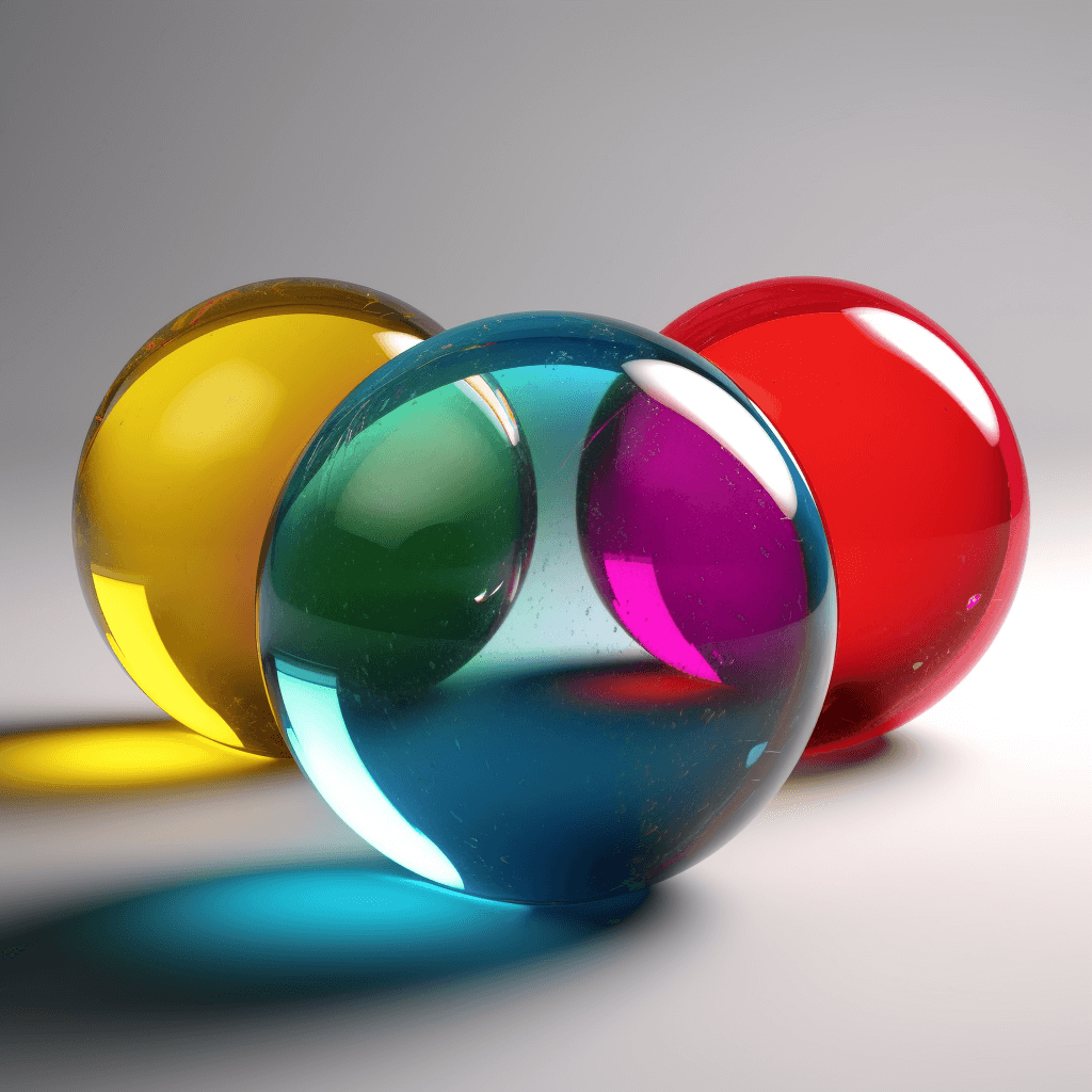
They are the stuff that can’t be created by blending other colors. The overlapping areas then produce the secondary colors, each of which results from the two adjacent primary colors. Blue and yellow, for example, makes green. And as much as I struggled with the hinged Pelikan watercolor box as a kid, I remember one thing above all: when I mixed all the colors together, it always came out a very unsightly brownish stuff (but NEVER black)!
Of course, then there is the component of brightness, i.e. luminosity. Here again proven by the smart information found on Wikipedia (I’m so glad that no professor has to look over here anymore):
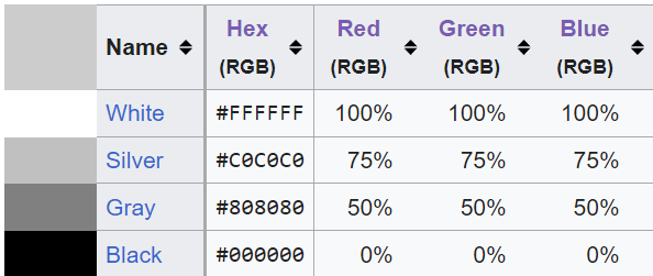
https://en.wikipedia.org/wiki/Web_colors#Hex_triplet
With all this information, we can mathematically determine and recognize all the colors in the physical and digital world.
Holy moly, when I look at some posts on the internet, a shiver runs down my spine. So many rules about the use of colors. But they are usually not practical rules, like “Wine on beer, give good cheer; beer on wine, you’ll repine”. They are mostly simply rules, that tell you, what you must never do with certain colors. Why? “Because it’s just wrong”. Now, we are all a lot smarter … Thank you for that.
If you google “colors and their meaning in presentations”, one statement stands out in particular: Use as few colors as possible. “Colorful is associated with children”. The more colorful the presentation, the less seriously the content is taken. The lecturer loses seriousness and competence, colorful slides are playful and infantile. What a sweeping statement. Before I started to work on this blog article, I always asked myself, “how much can you do wrong with colors?”. But here we go, it will be a wild ride, I can tell you that much.
-
- In presentations, red acts as a signal color that should not be used extensively, because if the audience literally sees only red in a presentation, they easily become “aggressive.” The presenter would not be helped by this, he basically presents himself as a target of attack. I would like to counter that there are enough presentations, which could be dunked in red and the audience would sleep nevertheless. So here we would have to talk about much more than just red color.
- In presentations you should avoid black slides. In the following linked article this is explained with the “fact” that black stands for sadness and grief. Excuse me, but I can’t stand more cliché. From my point of view, complete crraaaap 😉. As a counterexample, I want to bring Mercedes to the witness stand. A company that has always used black in contrast with elements in white, silver and more recently blue to give an elegant and luxurious feel.
Alright, one last example: now we have a black presentation with green lettering. “You can’t look at it for a long time, it makes you sick. You can’t concentrate. You can’t do it like that”. It’s often cited as the negative example per se. But stop … they really want to tell us that working at IBM – or with any early computer – was actually torture?

How many people have looked at it for hours every day and did not get tired, aggressive or even stupid for that matter, but have made breakthrough developments that have permanently changed our world for the better. But 20 minutes of presentation with black slides makes your audience tired. Yeah, only experts here …
So, let me slow it down for a moment and state the following: Some people have come up with A LOT of rules, telling us how to and how not to use colors in presentations. For me, it’s clear though: Rules are there to be … well? … yes, exactly … 😉.
Not least because of this, one of the best inventions since chocolate came to light: Color palette generators!
Whether it’s Colors Cafe’s sensational Instagram page or Adobe’s Color Picker, all these supposed rules can be broken so easily. The only rule is: the dose makes the poison. Of course, color combinations can look like crap, and of course, a presentation that’s all red, black, and gray with only black and white imagery can easily remind you of certain propaganda material. But once we make ourselves free from all those supposed associations: red numbers, blue sky, green meadow. Free from the idea that with red we necessarily give a warning, with black we mourn, with green we symbolize sustainability, and orange is appetizing. Then we can think about whole new “rules”. Be the rule maker, not the rule breaker!
Let’s put it this way: if I’ve already shown my negative numbers in blue for two slides, noted it in my legend as well, and my main accent color is pink, then after just two slides the audience’s brain is grooved in and doesn’t cry about, “where are my negative red numbers, why are they blue, I can’t stand this.” Quite simple really.

So, let’s completely renounce the rules that someone else wants to impose on us? Well, at least almost. Because as is so often the case, I like to dance through my own little world free of all rules. Of course, I still have to tell you: colors naturally have an effect. Of course, we have learned associations with colors that cannot be denied. And the fact that colors can have different effects in different cultures and societies is basic knowledge that you simply have to have in today’s very international world.
As I said, nobody denies that colors can influence our life, our mood, our feelings, or even our health. If we just google the topic “color therapy”, the craziest things pop up. And by the way, there are more color experts than presentation experts. At least according to the number of google hits.
In color therapy (chromotherapy), the positive effect of colors on the human organism is used for healing purposes. Blue light has a calming effect, red light is stimulating and warming.
Hospitals are intentionally designed in bright and clean, i.e. “hygienic” colors, because they are supposed to appear sanitary. This opens the vessels and psychologically conveys spaciousness, tranquility and trust. It thus has a mentally relaxing effect – exactly what we naturally would want in a hospital.
Established sayings suggest certain emotional influences ” I see red” or “She is green with envy” or “Into the blue” have meanings in color theory and psychology. But red also stands for love. Green for sustainability, etc.
Nevertheless, my point still stands. We can’t keep telling people to stand out and be unique and in the same sentence advise them not to stand out because the colors and conventions don’t allow it. That makes no sense. As I said, rules are (also) there to be broken purposefully. You just have to know your goal. For example, there are super stylish black presentations because they were created with a certain degree of design experience. Composition, font, image layout, graphics, message … all of these components have just as much impact. It’s similar to certain runway looks: not everyone can wear that, and not everywhere the right setting for extravagance. But when it is suitable, the effect is incomparable and unforgettable.
In any case, I think it’s important to give our customers the following advice:
Color theory and psychology are highly exciting, very broad fields. Equally interesting are the trends, cultural, and social associations, but if you are presenting and you have chosen a style that intuitively suits you and matches your personality, please don’t be intimidated by all these rules and tips.
*Disclaimer: Unfortunately, this article does not consider people with red-green weakness or other optical limitations.
Ask a design professional, that’s what we are here for. We help you to define your own (color) rules, show you how to implement them and how to utilize them purposefully.
Being brave pays off! Always.
Contact us at any time. We are happy to hear from you.




 HiLo_Agency
 HiLo_Agency