
 HiLo_Agency
https://hilo-agency.de/wp-content/uploads/2025/03/HiLo-Agency_Blog-Thumbnail_The-Power-of-Less.jpg
400
495
Haefele
https://hilo-agency.de/wp-content/uploads/2019/08/Hi_Lo_01-final-80-80-final-1.png
Haefele2025-03-27 09:56:362025-03-27 09:56:36Minimalism in Presentation Design
HiLo_Agency
https://hilo-agency.de/wp-content/uploads/2025/03/HiLo-Agency_Blog-Thumbnail_The-Power-of-Less.jpg
400
495
Haefele
https://hilo-agency.de/wp-content/uploads/2019/08/Hi_Lo_01-final-80-80-final-1.png
Haefele2025-03-27 09:56:362025-03-27 09:56:36Minimalism in Presentation DesignTypography – a short crash course on typefaces

by now digital fonts are generally part of our everyday life. We see them on websites, logos, shop window lettering, magazines, and even occasionally on little notes left on the windshield by city officials for bad parking jobs.
Typefaces are everywhere; but even in the design industry, I am sometimes amazed at how little thought is given to the attribution of fonts and typefaces, and how rarely the components are accurately named. So, a smidgen of knowledge about typeface and design might make communication easier when it comes to design briefs, so designers and clients do not misunderstand each other.
Anti-what?

Fonts, and almost all fonts, are also called Antiqua. Here we distinguish whether they are script fonts, sans serif Antiqua or Antiqua with serifs. Ah, already we stumble over our first vocabulary word: “serifs”.
Serifs – the little tips that supposedly make reading easier.
Recently the question came up, what are serifs good for anyway?
In lithography, serif letters were almost only exclusively used. This was supposed to make it easier for the eye… that’s how publishers and printing experts see it. Many books are still printed with a serif typeface when they have a dense text body.
Have you ever noticed that especially inexpensive books, trivial literature, inexpensive paperback crime novels or even children’s and youth books are printed in serif fonts?
Clean fonts that have a certain symmetry are called Linear Antiqua.
Arial, Calibri, Gill Sans, and Futura are just a few examples of sans serif Linear Antiqua. Their characteristics lie in their straightness and that they have little contrast in their weights. Very often, the ascender of the lowercase letters, is equal to the Cap hight.
Ah, such vocabulary words again:
Cap height is the correct term for the size of the letters- the big ones are upper-case letters and the small ones are lower case letters.
Family Time

Small and big letters can be found just like small and big people in your own family.
There are also type families are the unique classification of a typeface, according to its characteristics
At a glance
| Family | Features | Examples |
|---|---|---|
| Serif Linear Antiqua | Distinctive serifs, dynamic, traditional, bulky | City, Memphis, Joanna, Rockwell, Lino Letter, Clarendon, Antique, Egyptian |
| Linear sans serif | Geometric, rational, modern, straightforward, clear basic forms | Helvetica, Optima, Grotesk, Avenir, Arial, Vectora, Open Sans, Calibri |
| Script fonts | Dynamic, mostly slanted, sweeping strokes, often letters connected | Linoscript, Mistral, Slogan, Pepita, Snell Roundhand, Medici Script, Berthold Script |
| Broken script, and foreign script | Dynamic, mostly the arcs are not connected, bent strokes | Alte Schwabacher, Engravers Old English, Claudius, Duc de Berry |
There are a total of 11 groups, which are distinguished according to the following criteria:
- The presence of serifs
- The shape of the serifs
- The angle or even the stroke width of what is known as the k“leg”
- The symmetry of the shoulder or the “arc”
- The course of the trailing outward stroke of the e.
Sooooo… now we need some clarification again because we have not heard anything about arcs and legs yet. So, let’s move on to the individual elements of the letters.
A bit of architecture:

4 Line-Priciple

Proportions
Each font has its own proportion. This means nothing more than the length a font takes when it is in its default setting. Some fonts simply have a narrower look due to their vertical property, and thus a shorter length. So proportionally the font is shorter, even if it has the same Point or font-size.

When I say that these fonts are in their “default setting”, I mean the spacing that someone has come up with for optimal readability of a particular font.
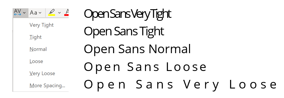
In type design, setting a single letter at the desired spacing from the other letters is called “kerning”.
In PowerPoint, we often play with the spacing out of fonts. However, we rarely place the letters one after the other. We use the font options, for example, spacing the font, i.e., to move it further apart.
The font options, whether a font is left-aligned, right-aligned, or centered, also play a big role in font design, but we will save that story for another time 😉.
Here’s an overview, of the best and nerdiest websites we could find on this topic:
So many detailed examples, so much to know about fonts, their structure, and their use. No one can say that typography is a boring topic.
And if we can help you find the right font for your presentations, get in touch, we’d love to hear from you.

Daniela Lopez
Author (hover to contact)
Hi&Lo AgencyHiLo_Agency
https://hilo-agency.de/wp-content/uploads/2025/03/HiLo-Agency_Blog-Thumbnail_The-Power-of-Less.jpg
400
495
Haefele
https://hilo-agency.de/wp-content/uploads/2019/08/Hi_Lo_01-final-80-80-final-1.png
Haefele2025-03-27 09:56:362025-03-27 09:56:36Minimalism in Presentation Design HiLo_Agency
https://hilo-agency.de/wp-content/uploads/2024/07/240624_Blog_3D_Visualierung_Thumbnail_EN.jpg
405
719
Haefele
https://hilo-agency.de/wp-content/uploads/2019/08/Hi_Lo_01-final-80-80-final-1.png
Haefele2024-07-31 08:18:432024-07-31 09:37:38More 3D for Your PowerPoint
HiLo_Agency
https://hilo-agency.de/wp-content/uploads/2024/07/240624_Blog_3D_Visualierung_Thumbnail_EN.jpg
405
719
Haefele
https://hilo-agency.de/wp-content/uploads/2019/08/Hi_Lo_01-final-80-80-final-1.png
Haefele2024-07-31 08:18:432024-07-31 09:37:38More 3D for Your PowerPoint HiLo_Agency
https://hilo-agency.de/wp-content/uploads/2023/10/231012_HiLo_Agency_Blog_Structure-is-all-around-us.png
1080
1080
Haefele
https://hilo-agency.de/wp-content/uploads/2019/08/Hi_Lo_01-final-80-80-final-1.png
Haefele2023-10-23 20:25:422023-12-18 12:06:28Structure Is All Around Us
HiLo_Agency
https://hilo-agency.de/wp-content/uploads/2023/10/231012_HiLo_Agency_Blog_Structure-is-all-around-us.png
1080
1080
Haefele
https://hilo-agency.de/wp-content/uploads/2019/08/Hi_Lo_01-final-80-80-final-1.png
Haefele2023-10-23 20:25:422023-12-18 12:06:28Structure Is All Around Us
 HiLo_agency