 HiLoAgency
https://hilo-agency.de/wp-content/uploads/2025/05/HiLo-Agency_Blog-Thumbnail_Non-Verbal-Communication.jpg
400
495
Haefele
https://hilo-agency.de/wp-content/uploads/2019/08/Hi_Lo_01-final-80-80-final-1.png
Haefele2025-05-29 12:04:582025-05-29 12:04:58Non-verbal Communication
HiLoAgency
https://hilo-agency.de/wp-content/uploads/2025/05/HiLo-Agency_Blog-Thumbnail_Non-Verbal-Communication.jpg
400
495
Haefele
https://hilo-agency.de/wp-content/uploads/2019/08/Hi_Lo_01-final-80-80-final-1.png
Haefele2025-05-29 12:04:582025-05-29 12:04:58Non-verbal CommunicationInformation Presentations – This could have been an e-mail?
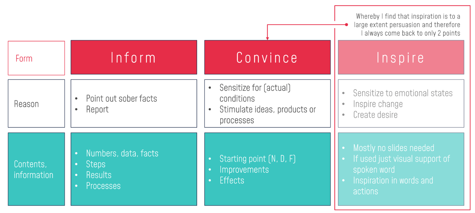
In my opinion, there are only 2 reasons to give a presentation: you need to inform, or you need to convince.
Recently, I participated in a Clubhouse roundtable discussion about online presentations. On that occasion, I realized once again how much entire work surrounding has changed for many people since 2020. Change always looks a little weird at first though, a bit like growing kids when their second teeth stand out way too big out of their mini faces. The change to make as many as possible contactless has also dragged our old meeting culture into the new environment.
That most companies chronically over-meet is something we hear all the time. Innovative companies make statements here and there about how meetings should be scaled back, open office spaces should enable better collaboration, and that PowerPoint is the devil himself. All this sounds a little different now.
So we wanted to give tips on online presentations in this roundtable discussion, and there we were, noticing that the topic of presentation has a different meaning for each participant and that each focus is completely different.
For coaches, the focus is on connecting with participants, interacting, supporting their virtual counterpart with uncertainties and questions.
For speakers, the focus is on transporting their message, that they can continue to create the charismatic aura and remain having motivational impact like they have on stage.
For me, the focus is on the visual part of a presentation. Explaining things pragmatically, vividly, so that numbers and the reasons for them come across clearly and directly understandable. My focus is the visual information transfer. When it comes to presentations, we actually have to separate that clearly. Not all presentations are the same and not all PowerPoint is the same. In our agency, for example, 70% of the business is about information presentations and only 30% about persuasive and motivational presentations.
So when you’re talking in a group and everyone has a different point of view, then in the reflection you wonder about how much your own focus actually contributes to the overarching topic.
The topic feels like a conversation about vehicles: Give some good tips on buying a vehicle! Don’t we first have to find out which vehicle? And where the focus is. Should it be used or new? Should it be inexpensive or luxurious? Is it a matter of appearance, image or practicality? Are we even talking about a car or are we talking about a motorcycle or a truck?
Information Presentations…
should quickly bring clarity about the status quo, sources of error, goals or renewals in meetings. Evaluations are presented and results are explained. These kinds of presentations are packed with information, diagrams, and charts. Usually, they are created on PowerPoint slides. Why? Because it saves time. Because it is practical. Because you can update the figures 2 minutes before the meeting, and so on.
Only the results and prognoses count as a basis for decisions and further steps of a company. It is not the place for charismatic presentations. It is not the place for emotional speeches. It is not the place to open a presentation with a quote or an anecdote.
Do you have to love what you do?
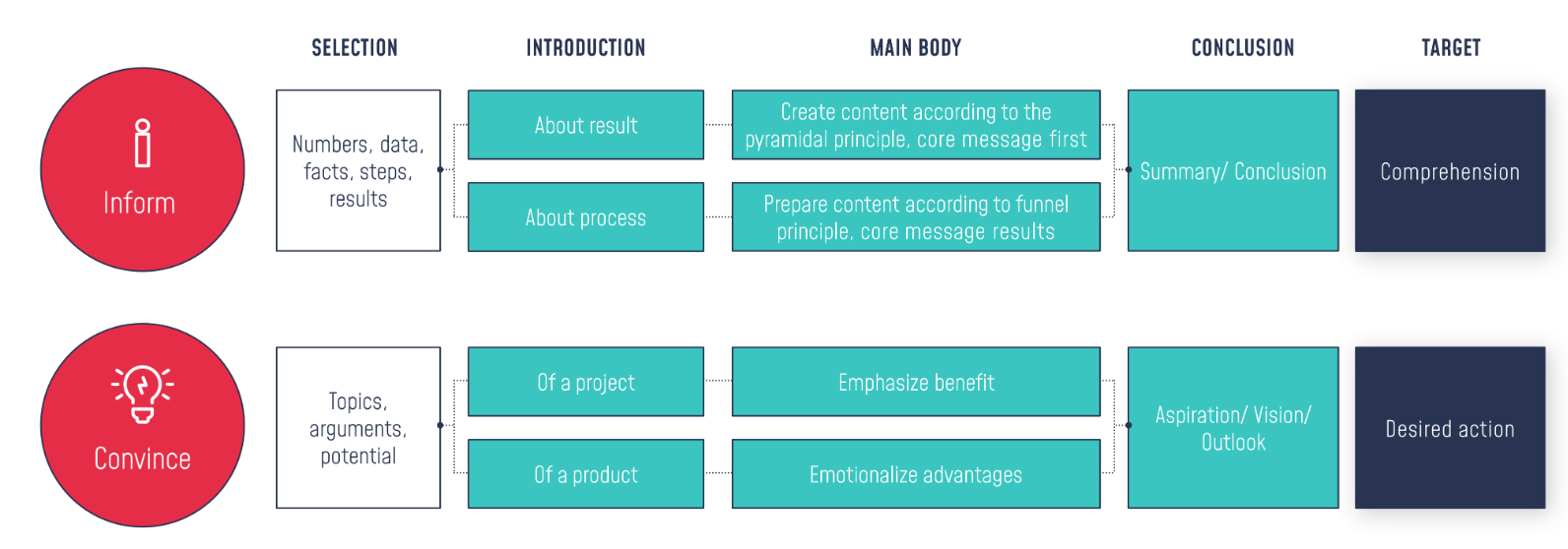
We are talking about people who are not voluntarily presenting. They must, because it is part of their job to deliver these reports in presentation form. If we take a closer look at this corporate framework, it confirms my two categories “Inform” and “Convince” and both types of presentations actually follow a simple structure:
If some poor sap in the company, i.e. professionally, is obliged to present, don’t we have to be fair and let this presenter get it over with, give him the best tools and visualizations and not burden him with being interactive, charismatic and connected with his audience?
Just because you don‘t like it, doesn’t mean it has no function!
Our service is mostly used by people who want to present things clearly and halfway visually appealing. Even though so many people bash PowerPoint and get upset about slide presentations and prefer to frantically scribble on a flipchart, a clearly structured PowerPoint is a practical, valuable and contemporary tool.
Visualizations are often perceived as daunting. Charts full of information, numbers, and frippery. Could we at least do something about the massive amount of content on these slides? Occasionally – but often it is simply the specifications that have to be adhered to. For example, with the given time frame, which is usually unrealistic, it can happen that an employee has 10 minutes of speaking time and is given a requirement of “maximum 2 PowerPoint slides”. We don’t need to discuss the fact that these requirements are ridiculous. But we as a service provider are sometimes attacked for producing such content slides but honestly we can recommend as much as we want to BUT if the presenter is bound to such specifications, so are we. We strive to present all this information in a brain-friendly way, so that we can at least make the visual aspect of our client’s suffering more bearable. And by the way: to his “audience” as well.
Are such meetings even allowed to be called presentations at all, or could it have been an e-mail?
Would you like support in creating slides or advice on the right format for your next presentation? Then get in touch with us, we are always at your disposal and look forward to hearing from you.


 HiLo_Agency
 HiLo_Agency
 HiLo_Agency
 HiLo_Agency