So why are so many people reluctant to use animations in their PowerPoints?
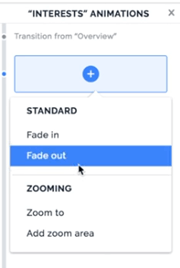
If a Presentation moves smoothly, people think it is Prezi. Prezi, dear friends of good presentations, has only (ATTENTION) the following animation options:

“But please do not animate the slides so much. We don’t want the textboxes to fly or see the content move around somehow” This is actually something many clients feel the need to say.
But where does this aversion actually come from?
Animations in PowerPoint are a little art in itself. If used incorrectly, the entire presentation appears nervous and unprofessional. But animations in presentations are soooooo valuable.☝️
Portals such as YouTube, Vines or Tiktok prove that videos and motion graphics are the most expressive media. The human brain reacts substantially better and faster on a motion sequence than on static pictures or the written word. It is easier to understand, faster to classify and provokes subconsciously emotions. Through these emotions we are more receptive and there is more activity in our brain and thus with our entire nervous system.
If a Presentation moves smoothly, people think it is Prezi. Prezi, dear friends of good presentations, has only (ATTENTION) the following animation options:

PowerPoint has over 40, which can be combined with 7 different paths. This brings us to (Crap… 40 times the combination with your own animations and 7 possibilities of paths. 40 times 7 or 7 over 40 or is it 40 faculties… or?
Whatever… IT IS A LOT.
When presenting information in a company, customers prefer to show the content statically, because they fear that the slide could look ridiculous to colleagues and superiors when in all reality it could be helpful to structure the content chronologically.
For cultural reasons, our eyes scan a presentation slide from top left to bottom right. In many cases however, the content starts somewhere else on the slide, maybe in the center at the bottom. The presenter might start his train of thought there and thus a dissonance is created for the viewer with a static slide. This dissonance causes a delay of understanding in the brain. Which is simply a waste of time.
Especially if the slide is a concept diagram, it is useful to direct the attention of the audience to what the speaker wants to point out. Of course, you can also do all this with a shaky laser pointer, but honestly… it is more ridiculous to hold your presentation with a cat toy than to animate the slide in a targeted and coordinated way.
✅ Sometimes it is safe to say that animations help rather than hinder.
A fully packed table with important numbers of the Business Year.
Even if every presentation expert is screaming and every designer thinks it looks like crap, it is often unavoidable that a simple table is necessary in one or the other presentation.
*Please note that these are information presentations that are still used in daily work and not speaker presentations that are spoken from a stage.
Back to our table. It is much easier to follow the numbers if you look at the columns one by one. You don’t have to go into every single cell, but at least you can highlight column by column or row by row, depending on how the structure is intended, so that the audience can follow better and their eyes do not wander senselessly over the slide while you are lecturing.
“BUT we have to send our presentations internally, so animations don’t make sense”
Of course we are talking about the part where the whole thing is introduced and explained first, your presentation. It is simply easier to keep your eyes on the charts that are sent out afterwards. Plus then people who attended your presentation already have a much better understanding of the pictures in front of them and your train of thought still much more present.
Restrained and targeted animation is therefore by no means tacky or cheesy it is an essential component of good communication.
If you have any questions about animations and information presentations, please feel free to contact us at any time. We look forward to hearing from you.

 HiLo_Agency
 HiLo_AgencyDress to Impress – Event-Master